Understand the headline KPI cards
The headline cards are your key numbers for the chosen period. Once you can read one card, you can read them all.
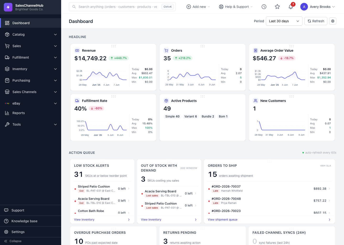
The headline cards across the top are your key numbers for the selected period. They all share one layout, so once you read a single card you can read every card.
What's on each card?
- Label and icon — the metric, such as Revenue or Orders.
- Value — the figure for the selected period. A dash (—) means there's no data yet.
- Change pill — the percentage up or down versus the previous comparable period, green for up and red for down.
- Trend line — a sparkline with Today, Avg, Max and Min for context. A few cards, like active products, show category chips instead.
Tip. Every card reflects the period chosen in the selector at the top right. Change the period and all the cards recalculate together.
Common questions
Why does a card show a dash instead of a number?
A dash (—) means there's no data for that metric in the selected period. Widen the period, or check that the underlying records exist.
What period do the cards use?
Whatever is set in the Period selector at the top right of the dashboard. Changing it recalculates every card.
Was this article helpful?