Table, summary and chart views
A report shows a flat table when summary mode is off and grouped totals when it's on. A summary can add a Bar, Line, Donut/Pie or Stacked bar chart.
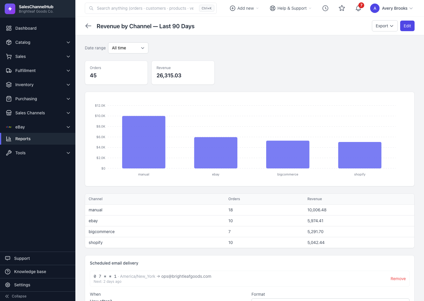
A report shows its results in one of two shapes, and a summary can add a chart on top. There's no separate "view" toggle: the shape follows how the report is built.
What are the three shapes?
- Table (flat) — with summary mode off, the report lists one row per record. Good for an order list or a stock-on-hand export.
- Summary — with Group & aggregate on, rows collapse into totals per group, with headline total cards above.
- Chart — in a summary, choose a Chart type (Bar, Line, Donut / Pie or Stacked bar) and it renders above the totals table.
Which chart type fits which question?
A line chart suits trends over time, like revenue by week. A donut suits a share-of-total breakdown, like orders by channel. The totals table underneath always carries the exact numbers behind the picture.
Tip. Charts only exist in summary mode. Turn on Group & aggregate first, then the Chart dropdown appears in the Summarize section.
Was this article helpful?